Every once in a while during Fashion Week a collection comes along that leaves one slightly perplexed and unsure. Do you like or dislike it? Does it intrigue or is it confusion? One studies the pictures, looks at the entire collection and then clicks out of the window once finished. Then he goes back and takes one more look… For Spring|Summer 2015, Honor is (well, has the honor of being… pun intended) the one. The fact that the collection makes one think twice allows it to be considered interesting.
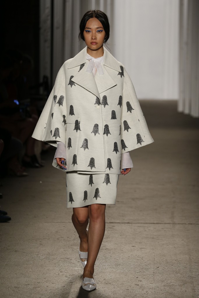
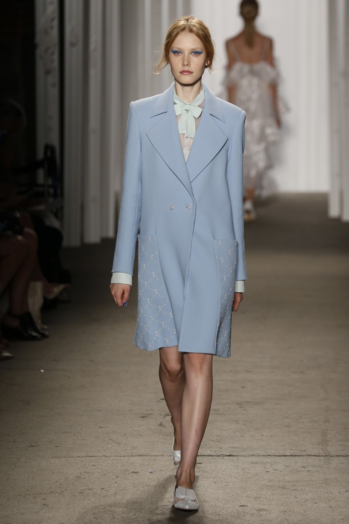
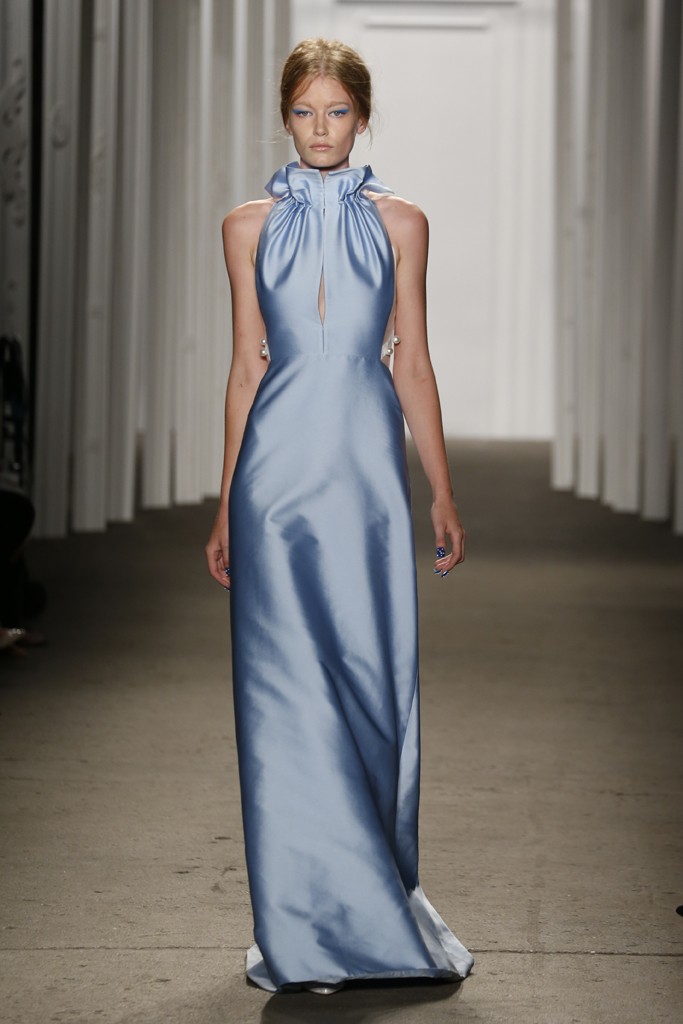
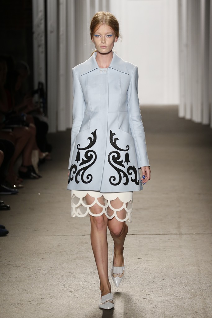
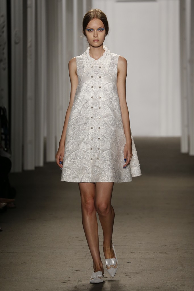
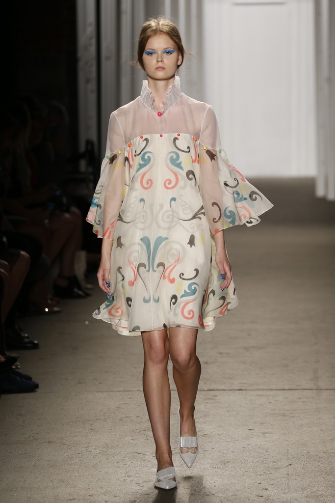
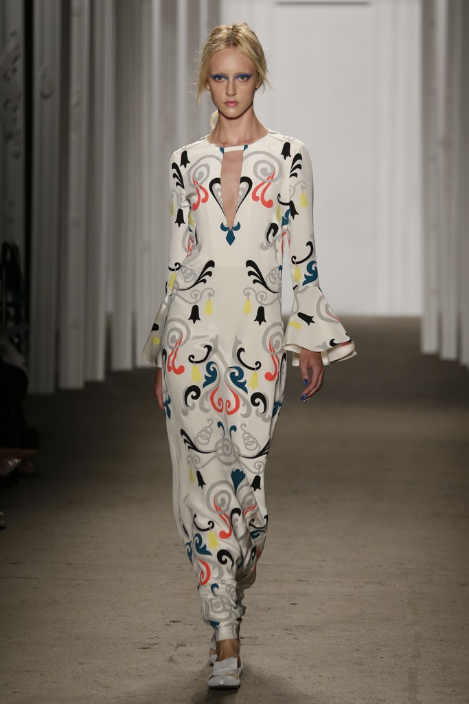
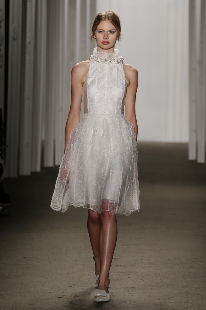
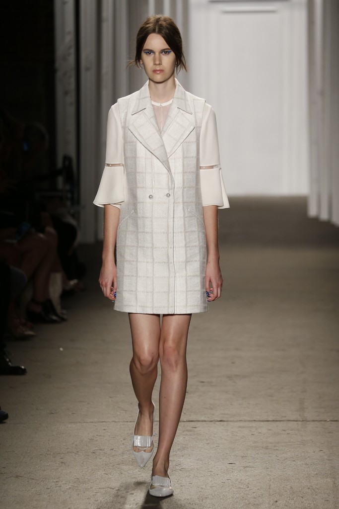
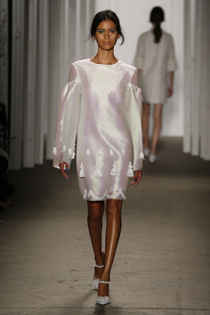
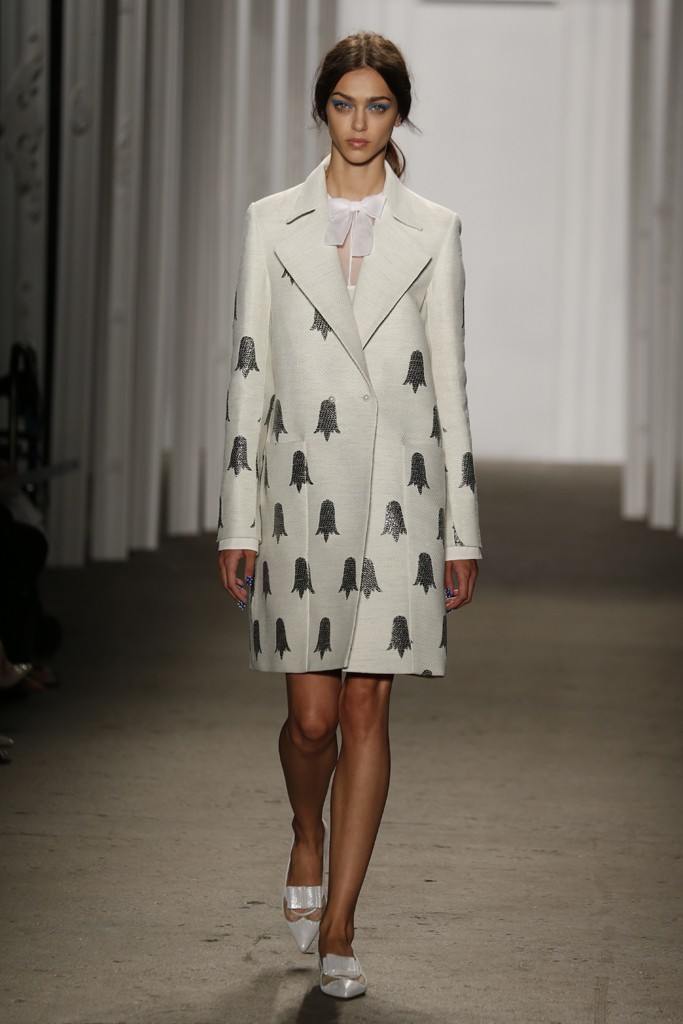
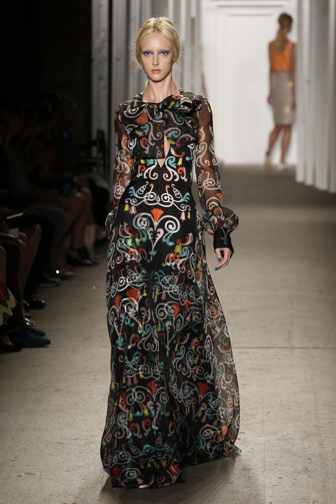
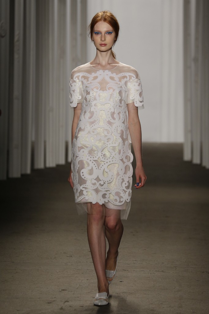
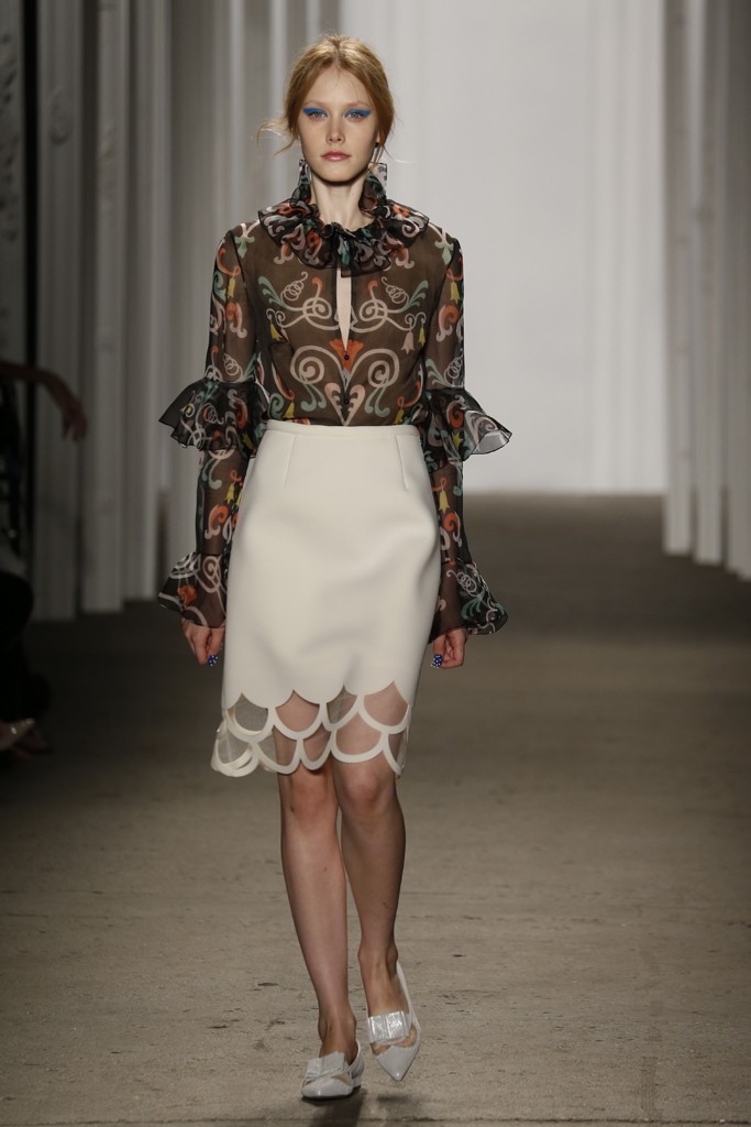
There is an agglomeration of contradicting elements. Loose, feminine silhouettes give way to structured, masculine coats. Transparent fish gills and upside-down tulip prints are visually retro while colorful beaded skirts and belts mimic the futuristic lights of Hong Kong. For the most part, the color palette is in different variations of white, making it relevant for the season but slightly monotone. There are instances where hues dip into light blue silk and midnight black georgette, but choices are limited. What lacks in color options, it is made up in dress lengths and sleeve styles.
In all, among the points of oddity there are pieces that are attractive. Given the current fashion sea of bland, Honor’s Spring|Summer 2015 collection helps inject some movement in the stagnant industry waters. Inexplicable. For those who are searching, they’re the I want something different pieces. | Giuseppe


pictures courtesy George Chinsee
